

The Role of UI in Enhancing Your Odoo Dashboard Experience
Odoo
5 MIN READ
November 17, 2023
![]()

In the world of business, efficiency is key to success. And when it comes to managing various aspects of a company, having a well-designed User Interface (UI) in your dashboard is more than just visually appealing – it’s a game-changer. Since we’re discussing UI excellence in Odoo, one name that stands out is Dashboard Ninja with AI, an ultimate Odoo dashboard app designed by Ksolves.
As a top-selling app on Odoo store, Dashboard Ninja with AI takes your data presentation to the next level, turning your dashboard into a powerhouse of efficiency. And here is the best part; Dashboard Ninja with AI is gearing up for a theme upgrade, promising a fresh look and feel.
But, why is UI so important in dashboards? In this blog, we’ll delve into the significance of UI in Odoo Dashboards and how a carefully designed interface can notably enhance efficiency in your business operations.
Understanding Odoo Dashboards
Odoo Dashboards serve as the nerve center for managing diverse business functions, from sales and inventory to HR and accounting. They provide a consolidated view of crucial information, helping users make informed decisions quickly. However, the real magic happens when these dashboards boast an intuitive and user-friendly UI.
When it comes to dashboard apps, there’s one that consistently holds the title of the best Odoo dashboard app – Dashboard Ninja with AI. Let’s take a closer look at why Dashboard Ninja has earned its reputation as the go-to choice for businesses seeking top-notch Odoo dashboard solutions.
A Closer Look at Dashboard Ninja with AI
Dashboard Ninja with AI is a robust and intelligent app designed for Odoo, empowering users to craft extraordinary reports and gain a comprehensive view of their business operations. It lets you view your business from a 360-degree angle with an interactive, engaging, and beautiful dashboard. This app goes beyond conventional reporting, providing a dynamic platform where users can effortlessly navigate and interpret crucial data. Whether you’re tracking sales, monitoring inventory, or evaluating performance metrics, Dashboard Ninja brings a new level of versatility and user-friendliness to Odoo, making data visualization an immersive and insightful experience.
Here are a few attractive features of Dashboard Ninja with AI:
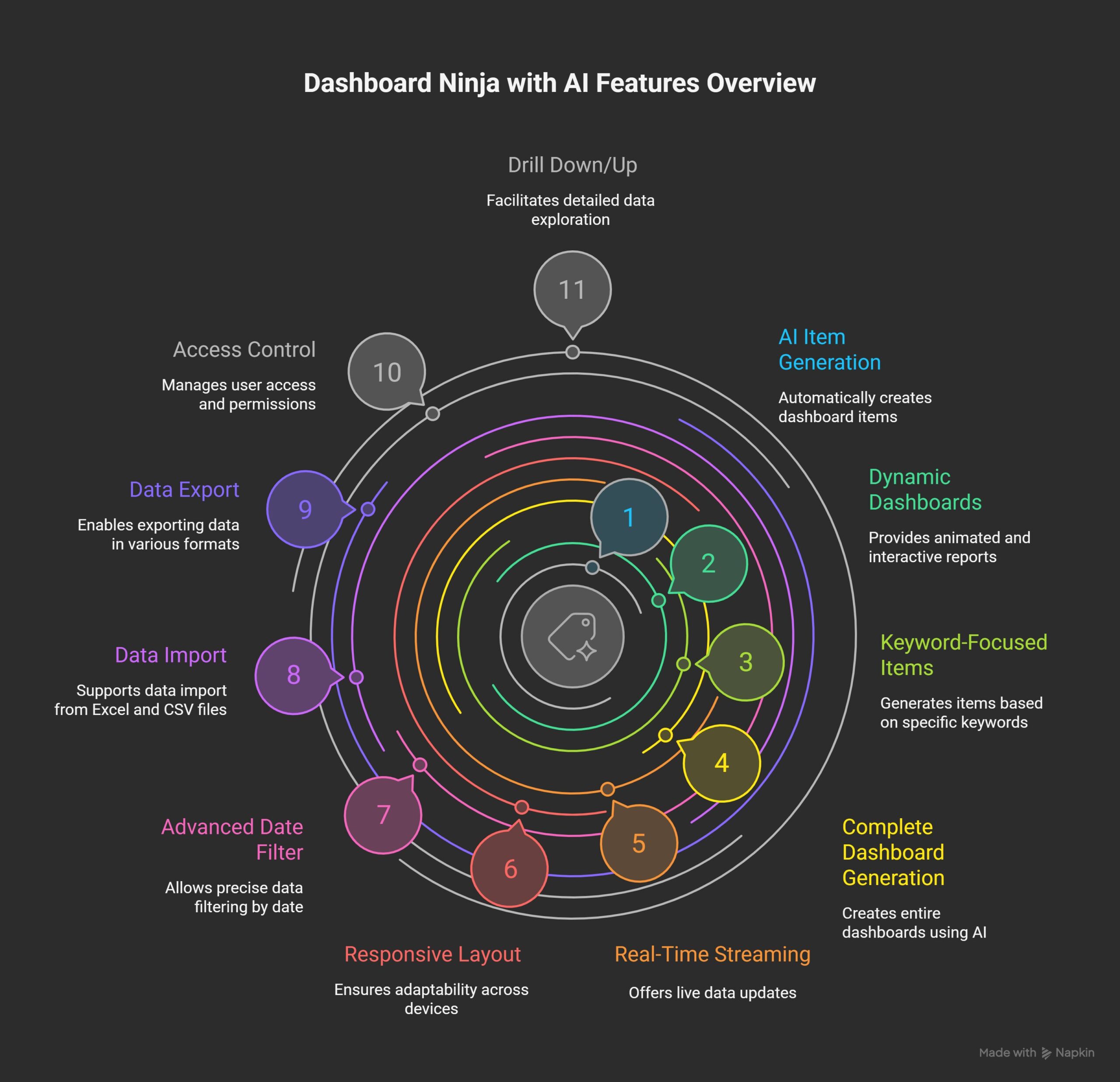
- Generate Items With AI
- Dynamic & Animated Reporting Dashboards
- Generate Keyword-Focused Dashboard Items With AI
- Generate Complete Dashboard With AI
- Real-Time Streaming Dashboard
- Responsive Fluid & Flexible Layout
- Advanced Date Filter
- Create Charts From EXCEL and CSV FILES
- Download Dashboard Items (Excel, CSV, PDF, PNG)
- Export & Import Dashboards Or Specific Dashboard Items
- Access Control
- Drill Down / Drill Up Data
Now, let’s take a closer look at how the User Interface (UI) plays a crucial role in shaping the dashboard experience.
The Human Touch:
A well-designed UI ensures that users can navigate the dashboard effortlessly, minimizing the learning curve. Odoo Dashboards, with their modular design and customizable elements, allow businesses to tailor the interface according to their specific needs. This not only streamlines processes but also ensures that users can focus on tasks at hand rather than grappling with a complicated interface.
Visual Appeal and Data Interpretation:
Humans are visual beings, and therefore an attractive UI tends to make the user more efficient. The platform provides a range of visualization tools – charts, graphs, and reports – to represent complex data in a comprehensible manner. An effective UI ensures that these visuals are not just eye candy but contribute to a deeper understanding of the data. With a quick glance, users should be able to grasp the health of their business, identify trends, and pinpoint areas that need attention.
Time is Money:
One of the primary benefits of a well-designed UI in Odoo Dashboards is the time it saves. A clutter-free, organized interface allows users to access information swiftly. Whether you’re tracking sales, managing inventory, or evaluating employee performance, a user-friendly UI eliminates unnecessary clicks and steps. This time saved translates directly into increased productivity and efficiency, two critical factors for any business aiming to stay competitive.
User Adoption:
No matter how powerful a dashboard’s features are, they are only effective if users embrace them. A clean and intuitive UI significantly enhances user adoption rates. Employees are more likely to engage with a system that doesn’t feel like a hurdle but rather a helpful companion in their daily tasks. A well designed dashboard, with its emphasis on simplicity and functionality, ensures that users feel empowered rather than overwhelmed.
The Road Ahead:
As businesses evolve, so should their dashboards. A well-thought-out UI is not just a one-time investment but an ongoing strategy for success. Regular updates, feedback mechanisms, and user-centric design principles ensure that the dashboard remains a valuable asset in the long run.
How Dashboard Ninja with AI’s Theme Upgrade Boosts Efficiency
In the latest update of Dashboard Ninja with AI, the introduction of a new theme isn’t just about appearances; it’s a game-changer for efficiency. The refined look and feel are carefully designed to improve user experience, making data interpretation and decision-making more efficient than ever. With a user-friendly interface, the updated theme ensures easy navigation through the dashboard, reducing the complexity and enabling users to access critical information swiftly. These visual enhancements not only contribute to a more appealing design but also significantly enhance the overall functionality of the dashboard, ultimately elevating efficiency in data analysis and decision-making processes.
![]()
Frequently Asked Questions
How does UI improve efficiency in Odoo Dashboards?
A well-designed UI simplifies navigation, reduces learning curves, speeds up data access, and boosts productivity through clear visualizations like charts and graphs.
How does the new theme upgrade in Dashboard Ninja enhance user experience?
The upgraded theme improves navigation and data interpretation with a refined, user-friendly design, enhancing efficiency in analysis and decision-making.
Why is user adoption important, and how does UI help?
User adoption ensures dashboard features are utilized. An intuitive UI makes the system approachable, increasing engagement and productivity.
How does UI support data visualization?
UI provides clear charts, graphs, and reports, making complex data easy to understand and helping users identify trends quickly.
Can Odoo Dashboards be customized?
Yes, Odoo Dashboards offer modular, customizable designs to meet specific business needs, streamlining processes.
How does Dashboard Ninja with AI stand out?
Its AI capabilities, real-time data, responsive design, and upcoming theme upgrade make it a leading Odoo dashboard solution.
Where can I learn more about Dashboard Ninja with AI?
Visit the Odoo App Store or contact Ksolves for details on features and pricing.


AUTHOR
Odoo
Neha Negi, Presales and Business Associate Head at Ksolves is a results-driven ERP consultant with over 8 years of expertise in designing and implementing tailored ERP solutions. She has a proven track record of leading successful projects from concept to completion, driving organizational efficiency and success.
Share with